Web design case study
MakerChange Studio
Website design, website build
The Client
MakerChange Studio is a creative agency with a clear ethical focus. They work with charities, NGOs and other purpose-led organisations, producing brands, campaigns and digital work that support positive change. As the studio grew, they were refreshing their identity to feel more established, confident and professional, while still keeping the energy and edge that made the brand distinctive. The new brand design was created by Katie O’Rourke, and the website formed a key part of that wider repositioning.
The Brief
MakerChange needed a new website that reflected the maturity of the refreshed brand and spoke more clearly to the audiences they most wanted to reach. The wider brand brief highlights potential clients, existing clients and freelance collaborators as key audiences, with a need to appear memorable, trustworthy and established.
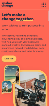
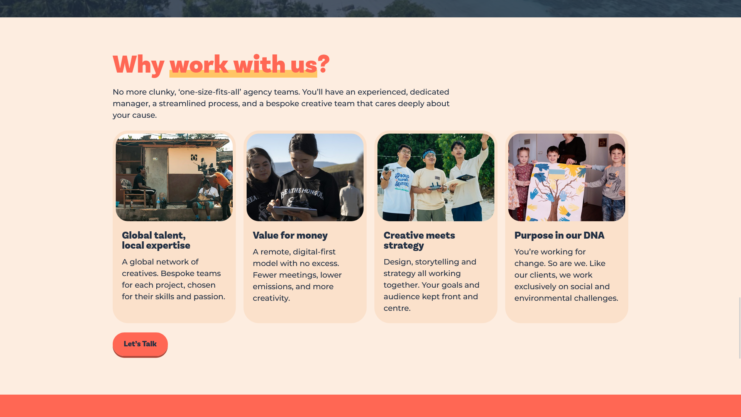
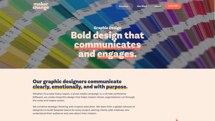
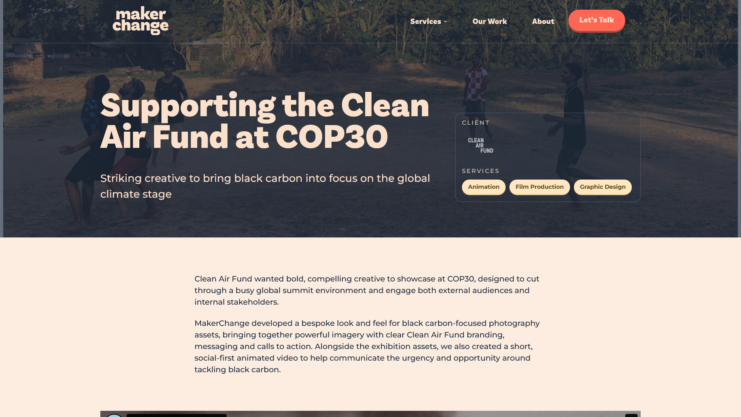
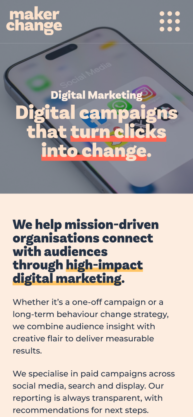
The site also needed to do a better job of showcasing the breadth of their services. This was not just about presenting case studies nicely. It was about showing that MakerChange offers a wide range of creative services, from video production and animation to strategy, digital marketing, web design and development. Early planning for the site also made it clear that work and case studies would play a central role, with featured projects, testimonials, service pages and individual case study pages all forming part of the structure.
One of the biggest practical goals was to make those case studies easier to maintain. MakerChange wanted their work to stand out visually, but they did not want to rely on a designer or developer every time they needed to publish a new project.
What I Did
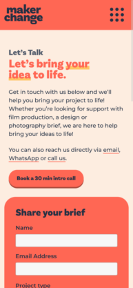
I designed and built the website, using Katie O’Rourke’s excellent brand work as the starting point for how the site should look and feel. Rather than going through a more traditional design phase with static mockups, we took a rapid prototyping approach. Since we had already worked together a lot, MakerChange trusted me to develop ideas directly in the browser and share design iterations as real working builds. That gave us a faster, more collaborative process and helped the design evolve in a more natural way.
The site itself is a completely bespoke WordPress build. I developed a custom theme from the ground up and used the WordPress block editor rather than a page builder. Behind the scenes, that included the CMS architecture needed to keep the site flexible and easy to manage, including custom post types, custom templates, tailored editor tools and a library of reusable block patterns.
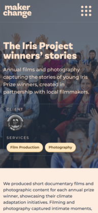
A big part of the project was making it easy for MakerChange to publish rich, polished content themselves. I created a set of custom blocks that let them pull in and display content dynamically, including carousels for case studies filtered by category and testimonial blocks they can keep adding to over time. I also built a library of block patterns so they can assemble new pages and case studies more quickly, without losing visual consistency across the site.
Those tools were designed to give them freedom without making the site harder to manage. The result is a system that allows for more depth, more visual interest and more flexibility, while still producing clean, semantic, accessible and SEO-friendly markup.
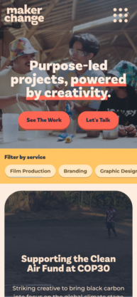
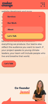
Performance and accessibility were both major priorities throughout the build. That matters on every project, but it felt especially relevant here given the nature of MakerChange’s work and the audiences their clients often need to reach. The final site is image-led and visually rich, but still performs strongly and feels fast to use.
I also introduced subtle animations and micro-interactions throughout the site to make it feel more fluid and engaging. These details help bring the brand to life without getting in the way of the content.
The Result
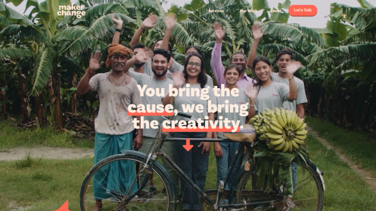
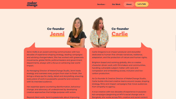
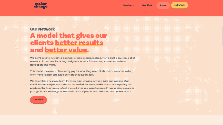
The finished website gives MakerChange a much stronger platform for presenting who they are and what they do. It feels more mature, more refined and more confident, which fits the direction of the new brand and the calibre of the organisations they work with. It also gives much greater visibility to the full range of services they offer, rather than letting the studio be defined by only one part of its work.
Just as importantly, the new site is far easier for the team to maintain. They can now add case studies, testimonials and new pages much more quickly, using a flexible set of tools that keeps everything looking polished and consistent.
The end result is a website that better reflects the quality of MakerChange’s work, the strength of their network and the ambition of the clients they support. Since launch, MakerChange has continued to grow and take on exciting new projects, and the website gives them a fitting place to showcase that work.
Andrew is an absolute pleasure to work with. His creativity, reliability, and exceptional attention to detail consistently impress me. He brings fresh ideas to every project, approaches challenges with a thoughtful and open mindset, and always delivers top-quality work. Andrew’s dedication and collaborative spirit make him an invaluable partner, and I truly enjoy every opportunity to work alongside him.
Jenni Hollis
Co-Founder, MakerChange Studio