“Please, please… read the newsletter.”
She wasn’t begging, but she wasn’t not begging either. It was the tone of somebody putting real time and energy into something important, and suspecting that relatively few people were actually reading it.
This was the headteacher at my son’s school during a parent meet and greet. Doing what I do, I had my suspicious as to the reason so many parents weren’t reading the newsletter. It wasn’t the information. It was the format.
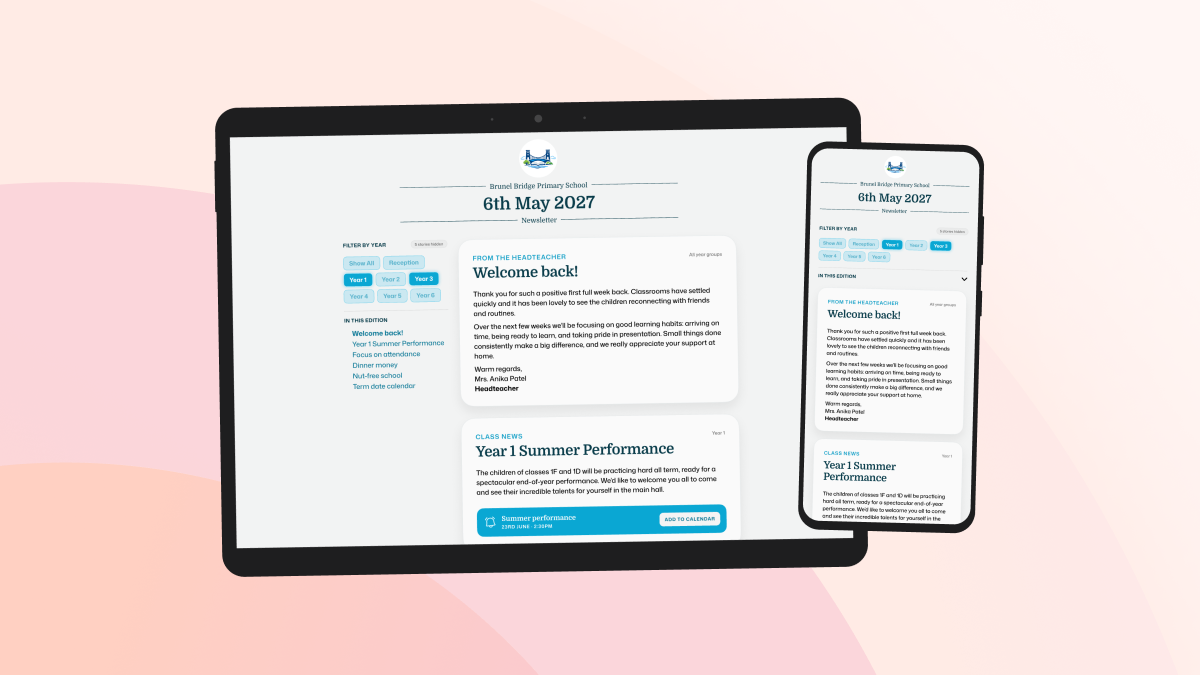
The school was sending their weekly newsletter out a two or three page A4 PDF. That format makes sense for printing, but it’s much less suited to a phone, which is where most parents read it. The text ends up cramped, the reading order isn’t always clear, and on a small screen you’re stuck pinching, zooming and panning around in every direction.
That’s not a criticism of the person making it. In most schools, the newsletter is put together by somebody who already has a million things to do. They have to gather updates from across the school and force them into a Canva template or some other design tool and nudge everything around until it fit.
There was another issue too. A lot of the content would be relevant to some families, but not all. I have a child in Year 4, so I don’t need to know about a Year 1 trip to Cheddar Caves. The really important bits, deadlines, reminders, dates, forms, can easily end up buried among things that don’t apply to you.
I did a very unscientific poll in my class WhatsApp group (yeah, I’m that guy) to see if my assumption was correct. Nearly everybody said they read the newsletter on their phone. The few who didn’t mostly said they didn’t really read it at all. The problem wasn’t apathy, it was comms fatigue.
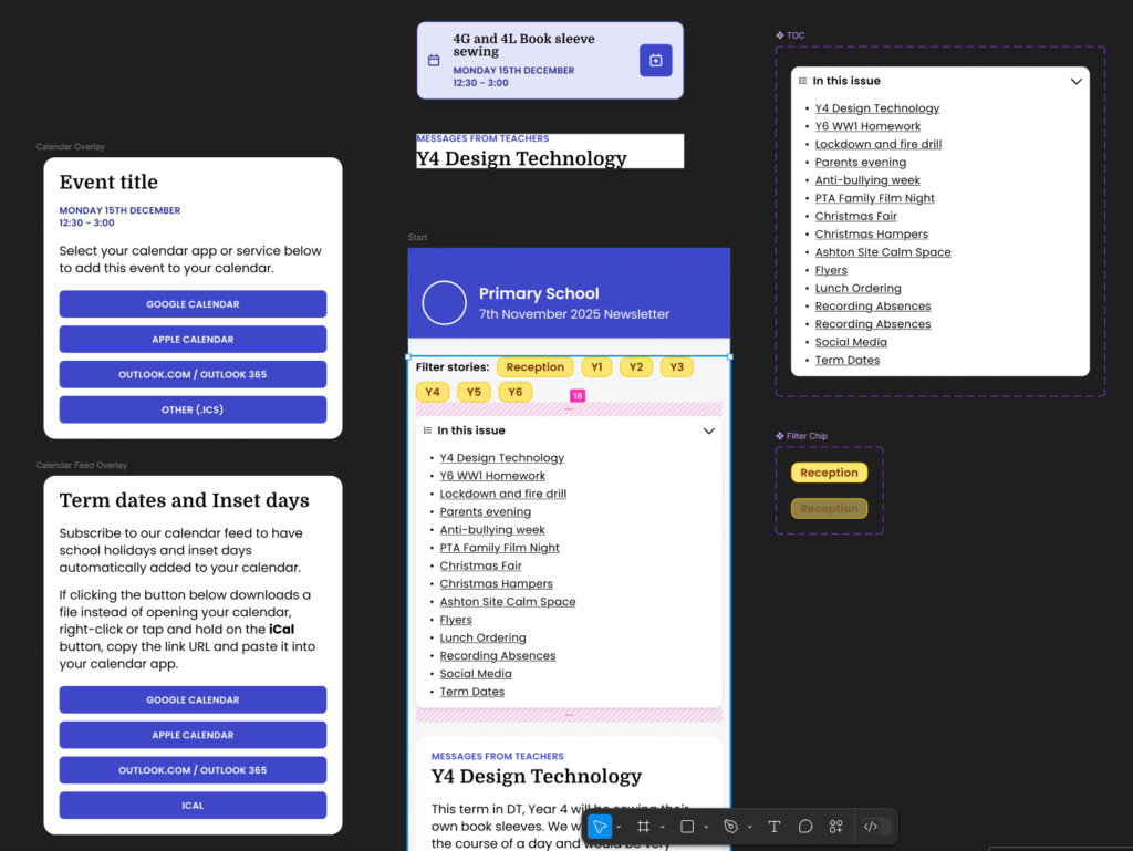
Being a web developer, my thought was obviously, “a website would fix all that”. If the newsletter lived on the web as a responsive, mobile-friendly webpage it’d be instantly easier to read. Then I thought about the other opportunities a web-based approach would open up. Stories could be filtered by year group. Diary dates could stand out and be added to a calendar in a couple of taps. Term dates could be published as a live calendar feed instead of every parent having to copy them from the school website to their calendar app every year.
After this had been rattling around in my head for a few weeks, I spoke to the headteacher at the school gates one afternoon and asked if I could share some ideas about the newsletter. Her response was an emphatic “yes”.
I was slightly worried that I was going to offend somebody. The newsletter was clearly a lot of work, and I was just waltzing in unsolicited to offer my two cents about all the problems with it. Fortunately, when I sat down with the headteacher and school secretary, they were very receptive. They talked me through all their headaches with the current tool (a cumbersome Canva template) and I explained my ‘grand plan’ for a modern school newsletter.
We agreed that I would build a brand new newsletter authoring tool, they’d pilot it, and that was the beginning of Ecko (or “the newsletter thing” as I was calling it then).
Development
At this point I just wanted to solve a specific problem in a way that felt more useful for parents and make things easier for the school, so I built the prototype. I hadn’t even given much thought to the idea that this might be useful to other schools as well in the future.
Over the next few weeks, I collaborated closely with the school to turn the prototype into a working MVP. As a parent and web developer, I had loads of ideas about the ‘parent experience’, but the school secretary’s input is what really made the editor experience so quick, efficient and easy to use.
By December 2025 we were ready to send out the first Ecko newsletter to a single class as a sort-of beta test. We ran a short survey to collect bug reports and gather feedback and the response from parents was 100% positive, with some great feature requests and ideas. A couple of weeks later we extended the beta test to a whole year group. Again, 100% positive feedback.
In January, we rolled it out across the whole school, a large primary with around 630 pupils. Since then, I’ve kept improving it based on real world use and further feedback from the school as they’ve settled into it. Parents seem to love the year group filter and the add-to-calendar features, and readership is steadily rising too.
Introducing… Ecko
Ecko replaces the cramped PDF template newsletter with a clean, mobile-friendly web format. It lets parents filter stories by year group, spot diary dates more easily, add events to their own calendar, and subscribe to live term dates. On the school side, it also creates a much better publishing setup. Content can be structured properly instead of being squeezed into a page layout that was never really right for the job.
It’s still being developed. One of the next big updates I’m working on is contributor accounts, so teachers, staff and PTA members can submit stories directly into Ecko for review and approval. That should remove one of the remaining frustrations in the process, where content still arrives in dribs and drabs through emails, Word documents, PDFs and image attachments.
Ecko was designed to do one job very well: help schools create newsletters that parents will actually read… and it does.
What I like most about it is how it started. It came from hearing a real frustration, spotting a design problem at the heart of it, and then working closely with a school to build something better. It wasn’t dreamed up as a startup idea first. It started with a very ordinary problem that was making life harder than it needed to be.
If your school is still sending PDF newsletters, or if you’re a parent who regularly misses things buried in them, take a look at Ecko and pass it on.