
Happy New Year! I hope 2025 has started off wonderfully for you. For me, it’s already shaping up to be an exciting year because I finally did something that’s been on my to-do list for far too long: I’ve launched my new personal website!
Finally!
When you’re a freelance web designer, your own website tends to take a back seat. It’s a bit like a chef who cooks Michelin-starred meals for their clients but ends up eating beans on toast at home. When you spend your days trying to create fantastic websites for other people, it’s surprisingly easy to neglect your own.
But the thing is, for a web designer, your website isn’t just a digital business card – it’s your chance to practise what you preach. It needs to be a shining example of what you do. That means great accessibility, excellent SEO, and the latest web technologies and best practices, all wrapped up in a design that feels unique and memorable.
This year, with a surprising rare festive lull in client work, I fortified myself with a couple of Chocolate Oranges, stocked up on tea bags and cracked on.
My old site was old. When I built it, the WordPress Block Editor (aka Gutenberg) was barely a glint in the milkman’s eye, but in the last few years it’s come on leaps and bounds. From a developer’s perspective, I’ve been itching to try out some of the new tech (like the Block Bindings API) but that kind of experimentation just isn’t possible (or polite) on someone else’s dime. On my own site, with just my partner, toddler and an opinionated 7-year-old to answer-to, I finally had the breathing room to try all this exciting new tech out.
The thing I made
Development-wise, I wanted to create this site as a WordPress block theme, use core blocks as much as possible, and prioritise performance, accessibility and SEO. I also wanted to be more proactive in keeping it up to date and part of that was the blog (what you’re reading right now!). No social media platform seems like a safe bet nowadays, so I wanted somewhere of my own where I could share the occasional update or useful code snippet.
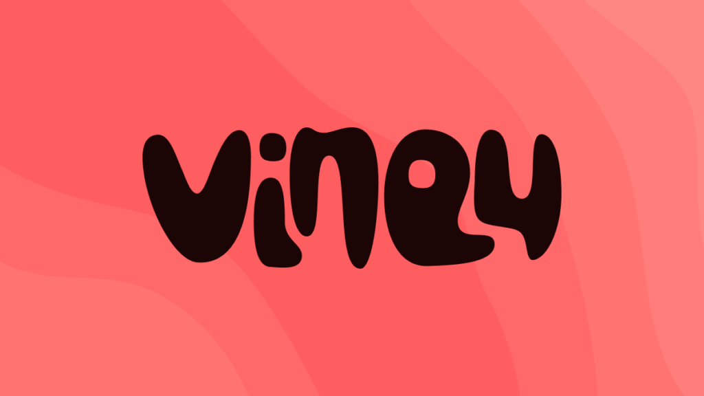
For the visual design, I didn’t have anything in particular in mind apart from this idea for a blobby, organic-looking logo. I thought the friendly, approachable, relaxed vibe suited me pretty well. Also, it was probably inevitable that I’d use my favourite font pairing at the moment: Fraunces and Outfit. The contrast between Outfit’s bold, sharp forms and Fraunces’ beautiful curves and flourishes looks great.
Overall, I’m pretty happy with it. I find the project carousel very satisfying to interact with, especially on mobile. The contact links are interesting too; I didn’t want the friction and potential limitations of using a form but I also didn’t want to put my email address out there in mailto links for all the world’s spam bots to find. I implemented a solution that hides a standard mailto link until a captcha is passed. Feedback from friends and family has been good on that so far but time will tell how effective it is at spam prevention. If it works out well, I’ll go into more detail on it in a future post.
So there it it, my first post on my shiny new blog. I’m sure not many people will read it but writing it has already proved valuable. It’s shown me how useful it can be to look back on a completed project and share the process in a way that makes sense to others.
That was nice. We should do this again sometime. Have a fantastic 2025!
Cheers,
Viney